
Protecting the digital systems, applications and networks that allow society to function from intentional and unintentional harm is a problem so complex that it cannot be achieved using human intuition alone.
An awakening is taking place within the Cyber Security domain, one that is fuelled by the same commodity that has led the likes of Amazon, Facebook and Google to become the most powerful private companies in the world: Data.
The application of Data Science within the Cyber Security domain offers significant opportunities for organisations to better protect themselves from cyber threats. A common use case being the implementation of machine learning models to monitor for malicious user behaviour, a task not suitable for human analysts to perform- especially for large organisations with thousands of employees.
In this article, I use Python and Pandas to explore the VERIS Community Data set, a composition of ~8,500 real world cyber incidents to answer a broad research question: “what are the common attributes of a cyber incident?”. By answering this simple question, I hope to show how it’s possible to use data to break down a complex problem into bite-sized and actionable insights.
Importing and configuring the Data
I imported the data by cloning the entire VERIS repo on GitHub to my local environment. Because each incident is stored in an individual JSON object, I used the helpful verispy package to extract the thousands of JSON objects into a single pandas dataframe:
import pandas as pd
from verispy import VERIS

data_dir = '~/VCDB-master/data/json/validated'
v =  VERIS(json_dir=data_dir) #creates a veris object

Found 8539 json files.

veris_df = v.json_to_df(verbose=True) #creates a dataframe from the veris object
Inspecting the dataframe reveals the extent of the VERIS Community Dataset (as of Jan 2020):
veris_df.shape()
(8539, 2347)
1. Who’s causing cyber incidents?
Understanding who is going to cause potential harm to digital assets, intentionally or unintentionally, is a natural starting point to address the research question and explore the data.
The VERIS database breaks down cyber threat actors into three categories:
-
External- anyone outside of the organisation e.g. hackers, nation states and former employees
-
Internal- anyone who is entrusted with access to internal systems e.g. full time employees, contractors and interns
-
Partner- Third party suppliers to the impacted organisation, who typically have some trusted access to internal systems.
To breakdown the incidents by actor type, I utilised the enum_summary function supplied by the verispy package:
df_actors_internal = v.enum_summary(veris_df, 'actor.internal.variety', by='actor')

df_actors_external = v.enum_summary(veris_df, 'actor.external.variety', by='actor')
N.B. I neglected to include the partner actor type because the total number of incidents caused by partners was low, and it detracted from the visualisation later on.
After some cleaning up of the df_actors_internal and df_actors_external data frames (see my GitHub code for further information), I concatenated them into one data frame df_actors_combined:
df_actors_combined = pd.concat([df_actors_internal, df_actors_external])

df_actors_combined.head()
Representing this data in visually stunning and interactive ways was made easy thanks to the Plotly express graphing library. I opted to go with a sunburst chart to show how internal and external actors could be broken down further into their actor types:
import plotly.express as px

fig_1 = px.sunburst(df_actors_combined, path=['Actor Origin', 'Actor Type'], values='Count')

fig_1.update_layout(uniformtext_minsize=12)

plot(fig_1, filename = 'Actor Origin', auto_open=True)
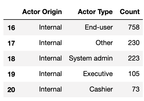
Internal and external actors are broken down further into their roles or alliances
For further information on embedding plotly visualisations into your pages, I recommend the following article.
What’s immediately obvious is the almost even distribution of incidents caused by internal and external actors — 52% external and 47% internal (~1% partner & unknown).
Cyber Domain Deep Dive 1
Organisations cannot underestimate the risk posed by internal threats, their privileged access to and working knowledge of internal systems makes it easy for them to cause harm- whether they mean to or not.
For the known data on internal actors, a significant proportion can be attributed to ‘end users’, which the VERIS documentation describes as the end user of an application or regular employee. I interpret this to mean an employee who has standard access to a system and uses it in their day to day work.
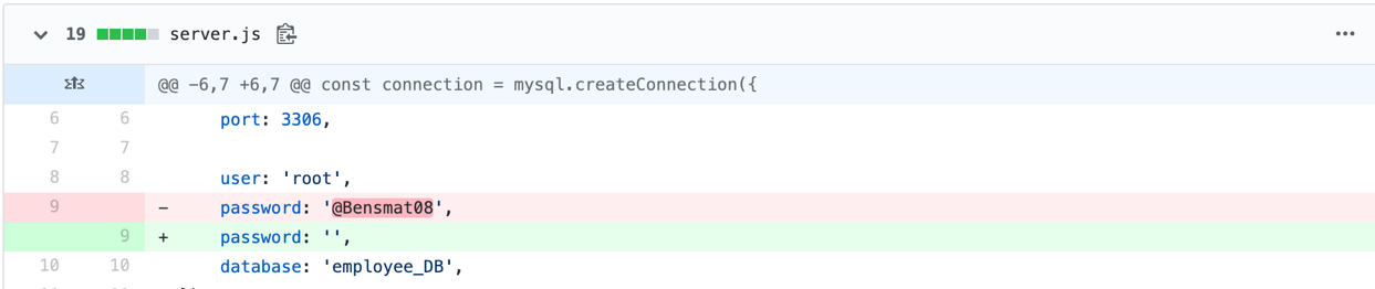
Interestingly, from my experience in DevOps environments, I anticipated the number of incidents caused by software developers to be much higher, given the elevated level of access and working knowledge they posses. For example, a developer could modify the underlying source code of software applications to benefit themselves someway, or simply leave secrets such as passwords and API keys exposed in code on hosted on GitHub:
To understand whether developers are acting maliciously or simply making mistakes, I further analysed the data by filtering the veris_df dataframe by internal developers and the actions they committed:
df_actors_developers = v.enum_summary(veris_df, 'action', by='actor.internal.variety')

df_actors_developers = df_actors_developers[df_actors_developers['by'] == 'actor.internal.variety.Developer']

df_actors_developers.plot(kind='bar', x='enum', y='x', legend=False)

plt.xticks(rotation=25)
plt.ylabel('Count')
plt.savefig('df\_actors\_developers')
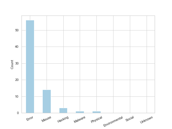
The resulting bar chart shows that of the 73 developer related incidents, 56 were errors (i.e. accidental) and the remaining 17 related to misuse, hacking and malware (i.e. malicious). Helpfully, VERIS provides a summary of the incident which I extracted for the 14 incidents labelled as ‘misuse’ and outputted them to a csv to make it easier to read:
df_actors_developers_misuse = veris_df.loc[(veris_df['actor.internal.variety.Developer'] == True) & (veris_df['action.Misuse'] == True)]

df_actors_developers_misuse['summary'].to_csv('developers\_misuse\_summary.csv', index=False, header=False)
One particular incident was caused by a senior IT director in the U.S who was also a developer. This developer:
“added a secret code to “random” number-generating computer software in 2005 that allowed him to narrow the drawing-winning odds in multiple games from as great as 5 million-to-1 down to 200-to-1… He hijacked at least five winning drawings totalling more than $24 million in prizes in Colorado, Wisconsin, Iowa, Kansas and Oklahoma”
Very naughty indeed. [I’ve uploaded the remaining summaries to my GitHub]
What this Cyber Domain Deep Dive shows is how we can go from asking the very general question “who’s causing cyber incidents” all the way through to discovering insights about how valuable the integrity of source code is.
2. What sort of actions lead to a cyber incident?
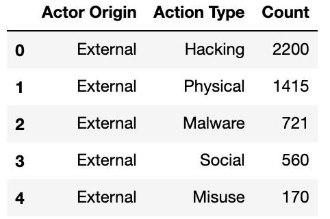
Having explored how developers typically cause cyber incidents, I take a step back and analyse the likely threat actions for all external, internal and partner actors. This is useful because organisations need to know how their internal and external threats are likely to materialise, so they can put adequate protective controls in place.
I wanted to visualise this insight using more of Plotly’s interactive charts, and decided a Sankey diagram would elegantly show the relationship and flows between actor and action. To create a Sankey then, I filtered the veris_df dataframe on actor and action:
df_action_actor = v.enum_summary(veris_df, 'action', by='actor')

Tidied the resulting dataframe up a bit:

df_action_actor.drop(['n', 'freq'], axis=1, inplace=True)

df_action_actor.columns = ['Actor Origin', 'Action Type', 'Count']

df_Unknown_3 = df_action_actor[df_action_actor['Actor Origin'] == 'actor.Unknown']

df_action_actor.drop(df_Unknown_3.index, inplace=True)
And used a mapping function to stop the code outputting ‘actor’ before each word i.e. ‘actor.External, actor.Internal, actor.Partner’:
map_origin = {'actor.External':'External', 'actor.Internal':'Internal', 'actor.Partner':'Partner'}

df_action_actor['Actor Origin'] = df_action_actor['Actor Origin'].map(map_origin)

df_action_actor.head()
The resulting dataframe now ready to produce a Sankey diagram looked like this:
I passed the above df_action_actor dataframe to the pre-built function gen_Sankey, specified the columns from which to produce the levels and values within the Sankey diagram, and outputted the resulting diagram by calling plot:
fig_4 = genSankey(df_action_actor, cat_cols=['Actor Origin', 'Action Type'], value_cols='Count', title='Sankey Diagram for Veris Community Database')

plot(fig_4, filename = 'Cyber Actions Sankey Diagram', auto_open=True)
The Sankey diagram suggests that some incidents within the dataset have had multiple action types assigned to them, because the count of internal, external and partner incidents increases slightly in comparison to the previous chart (~12% difference in incidents recorded when cutting the data by action type).
Cyber Domain Deep Dive 2
The diagram shows that ~90% of incidents related to internal actors are caused by Error or Misuse. This insight tells us that security departments can expect internal threats materialising as user behaviour, rather than malware or hacking activities, which typically require slightly different monitoring techniques. This is why the field of User Behaviour Analytics (UBA) has exploded recently and is enabling organisations to detect when a user is behaving abnormally in comparison to other users or themselves over a period of time.
Incidents related to external actors are caused by a more diverse set of actions. This makes sense given the actors have to employ more creative ways of obtaining access to a system in order to achieve their outcome. The ‘Hacking’ action seemed a little vague: what exactly does hacking entail? Can we isolate some trends in hacking? To answer these questions I had to add a datetime index to the dataframe and filter on incidents caused by hacking actions (resulting dataframe called combined ). For further information on how I did this please refer to my GitHub because it is too long to include in this article.
After cleaning the dataset I was able to extract the following plot:
ax1 = combined.iloc[:, 2:10].plot(kind='bar', stacked=True, figsize=(10,5))
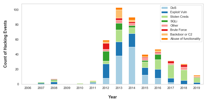
The chart shows more detail about what actions are constituted as ‘Hacking’. Denial of Service (DoS) attacks plagued organisations in 2013 and 2014 but, in recent times, appear to have become less of a threat to the organisations in the dataset. This is possibly because anti-DoS technologies have become more advanced and prevalent in recent years: Web Application Firewalls (WAFs) enable rate limiting on incoming web traffic, and are typically offered as standard by Cloud vendors on Content Distribution Networks (CDNs), Application Load Balancers and API Gateways.
However, the VERIS dataset is likely going out of fashion right now, because the data suggests there has been a steady decrease in hacking attacks since 2013. There are plenty of other datasets and statistics which indicate this is not the case. Indeed, as someone who works in cyber security and has a view on a variety of organisations, I can say with first hand experience that the number of cyber-attacks is on the rise.
3. How long does it take for organisations to detect and respond to cyber incidents?
Being able to detect and respond to cyber incidents in a timely manner can save entire organisations from going under. The longer it takes to detect and respond to a cyber incident, the more risk that organisation faces, and the greater potential for harm.
VERIS breaks down a cyber incident into 4 stages and records the time units for how long it takes for an organisation to reach that stage:

-
Containment: the point at which the organisation stops the incident from occurring or restores to business as usual.
-
Compromise: the point at which the actor has gained access to or compromised an information asset e.g. gained access to a sales database
-
Exfiltration: the point at which the actor takes the non-public data from the victim organisation (not applicable to all incidents)
-
Discovery: the point at which the organisation realises an incident has occurred
-
Containment: the point at which the organisation stops the incident from occurring or restores to business as usual.
N.B. VERIS only records the time to reach each stage in time units i.e. seconds, minutes, hours, and not the actual time stamp for reasons of confidentiality.
I wanted to understand how long it takes for organisations to detect and respond to cyber incidents, and represent that information using a heat map.
To do this, I first had to extract the timeline information from the dataset. I wrote a function (get_timeline_df(x, event)) that filters the dataset on a particular stage of incident and formats the resulting dataframe for the next stage of processing. See my GitHub for more details on the get_timeline_df function. I called the function 4 times, one for each stage of the incident:
compromise_time = get_timeline_df(‘timeline.compromise.unit’, ‘Compromise’)

discovery_time = get_timeline_df('timeline.discovery.unit', 'Discovery')

exfiltration_time = get_timeline_df('timeline.exfiltration.unit', 'Exfiltration')

containment_time = get_timeline_df('timeline.containment.unit', 'Containment')
And then concatenated the 4 dataframes into one:
timeline_df = pd.concat([compromise_time, discovery_time, exfiltration_time, containment_time])
timeline_df.head()
The resulting dataframe looked like this:
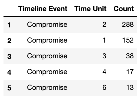
Within the get_timeline_df function, I map the string time unit to an integer value from 1 to 8 i.e. ‘Seconds’:1,…, ‘Days’:4,…, ‘Never’:8, so I could sort the values from longest to shortest timespan.
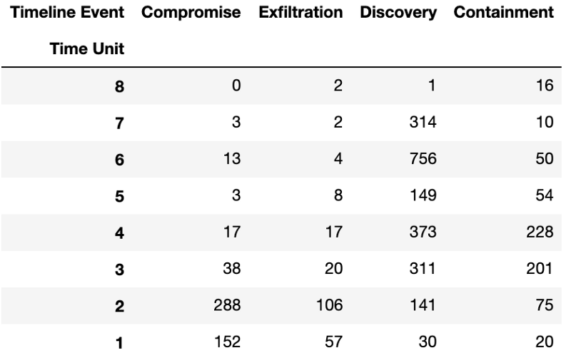
Heat maps can be created in seaborn by passing the data as a matrix. I converted the timeline_df dataframe into a matrix using the pd.pivot() function, reindexed the data against the 4 stages of an incident, and sorted the data from longest time unit to shortest:
timeline_matrix = timeline_df.pivot('Time Unit', 'Timeline Event', 'Count')

timeline_matrix.columns

columns_matrix_titles = ["Compromise","Exfiltration", "Discovery", "Containment"]

timeline_matrix = timeline_matrix.reindex(columns=columns_matrix_titles)

timeline_matrix.sort_index(ascending=False, inplace=True)
The resulting matrix looked like this:
Now I simply pass the matrix to seaborn’s heat map function and relabel the time units back to string values so they can be easily understood:
import seaborn as sns

fig_heatmap = plt.figure(figsize=(10,8))

r = sns.heatmap(timeline_matrix, cmap='BuPu', cbar_kws={'label': 'Count'}, linewidths=.05)

plt.yticks([7.5,6.5,5.5,4.5,3.5,2.5,1.5,0.5], ['Seconds', 'Minutes', 'Hours', 'Days', 'Weeks', 'Months', 'Years', 'Never'], rotation=0)
The following heat map resulted:
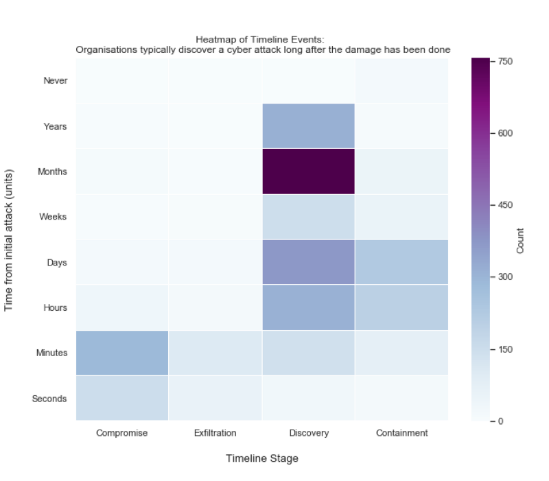
Cyber Domain Deep Dive 3
What’s immediately obvious from the heat map is that it takes a shorter amount of time to compromise and exfiltrate data than it does for organisations to even realise anything has happened. The high count of incidents that were discovered months after the initial attack correlates well with the accepted 2017 industry average of 101 days to discover a cyber incident according to FireEye.
Cyber professionals often to refer to the time between initial compromise and discovery the ‘dwell time’. One reason the dwell time figure is so high may be because of a particular subset cyber incidents referred to as ‘Advanced Persistent Threats’ or ‘APTs’. APTs like to remain unnoticed on an organisation’s systems for prolonged periods of time. Staying there helps the threat actor understand how the organisation works in order to achieve their objective e.g. steal data.
Why does dwell time matter? A recent paper indicates there is a correlation between dwell time and the average cost of a cyber attack. The longer the dwell time the more costly the attack.
Organisations can measure the effectiveness of their threat detection controls using their average dwell time as a KPI. Only through measurement can organisations get a true understanding of their cyber risk.
Cyber Security is a Data Problem
Everything that takes place in the digital world is recorded. A user clicking on a link in their browser, an employee getting their password wrong 3 times, a file transferred from one network location to another, are events recorded in digital format. These digital events can be used to protect organisations from cyber incidents, but only if the mountains of data that users, employees and systems produce each day can be wielded as a tool for good.
The VERIS Community Dataset is just one use case of applying data analysis to protect digital systems. Through observing general trends across thousands of incidents, organisations can understand where the threats are most likely to come from and how they’re likely going to try and cause harm.
Without big data analytics, companies are blind and deaf, wandering out onto the Web like deer on a freeway. - Geoffrey Moore