Anyone with a Monzo account can access their entire transaction history with a simple call to an API. The transaction history dataset is incredibly rich, can offer unique insights into your spending habits, and is a great resource for anyone learning data science and analytics. In this article, I will explore some of my own spending habit statistics and show you how to do the same using some basic Python programming.
Data science toolkit
Before jumping into the analysis, a quick note on the tools I’ll be using:
-
Jupyter Notebook - an online notebook which makes the running of code and exploration of data easier than writing it all in one big script (download here).
-
Python - a versatile programming language with many custom data science libraries.
-
Pandas - the most powerful and widely used data science and analysis library.
I’ve embedded all the code written as part of this analysis in my GitHub.
Loading and cleaning the data
First, you need to get the data into your Jupyter Notebook and formatted into a more friendly way, which can be achieved in 7 steps:
-
Log into the Monzo for Developers portal, and follow the authentication guidance within the API documentation to gain access to your data.
-
Hit the API by requesting the ‘transaction list’ in JSON form onto your local machine and save it as a JSON file. Important: you only have 5 minutes to do this before you have to request another access token, so do it as soon as you access the portal.
-
Within your Jupyter Notebook, import pandas and matplotlib (a library used to create charts) and then load the JSON data file into a dataframe.
-
Flatten the dataframe to make data analysis easier.
-
Convert the transaction “created” at column into a datetime series and set it as the index for the dataframe.
-
Convert the transaction amounts from pence to pounds and force positive amounts to correspond to purchases. This is done by applying a lambda function to the column.
-
Filter the dataframe so it excludes internal ‘pot’ transfers, because we are only interested in knowing about actual spending.
Each transaction is stored as a JSON object (see example below), and contains a number of key value pairs that we will use to extract some interesting insights later.
{
  "id": "tx\_00009T3RKKR0B36laVzJh4",
  "created": "2018-01-28T12:33:46.54Z",
  "description": "TfL Travel Charge      TFL.gov.uk/CP GBR",
  "amount": -450,
  "fees": {},
  "currency": "GBP",
  "merchant": {
    "id": "merch\_000092jBCaq2cHlL8pLVkP",
    "group\_id": "grp\_000092JYbUJtEgP9xND1Iv",
    "created": "2015-12-03T01:24:14.372Z",
    "name": "Transport for London",
    "logo": "https://mondo-logo-cache.appspot.com/twitter/@TfL/?size=large",
    "emoji": "🚇",
    "category": "transport",
    "online": true,
    "atm": false,
    "address": {
      "short\_formatted": "The United Kingdom",
      "formatted": "United Kingdom",
      "address": "",
      "city": "",
      "region": "",
      "country": "GBR",
      "postcode": "",
      "latitude": 51.49749604049592,
      "longitude": -0.13546890740963136,
      "zoom\_level": 17,
      "approximate": false
    },
Exploratory Data Analysis (EDA): transaction amounts
Now the data is loaded as a dataframe within the Notebook, we can start to do some Exploratory Data Analysis (EDA). EDA helps produce some basic statistical summaries of the data, and is a good way to familiarise yourself with a fresh data set.
I am interested in knowing some statistics surrounding the transaction amounts (£) for the 2,464 positive transactions in my dataset. (Remember that in step 6 I forced positive values to be purchases and negative values to correspond to payments or refunds.)
I filter transactions that have a positive amount, and assign them to a new data frame trans_pos_amount :
trans_pos_amount = trans[trans['amount'] > 0]
The transaction summary statistics for 2018, 2019 and 2018–2019 (combined) are then obtained using the built in Pandas method .describe() on the amount column in the new dataframe:
trans_pos_amount.loc['2018'].amount.describe()
trans_pos_amount.loc['2019'].amount.describe()
trans_pos_amount.amount.describe()
The resulting 3 summary tables returns some standard statistics including mean, median, standard deviation, interquartile range, and maximum value:
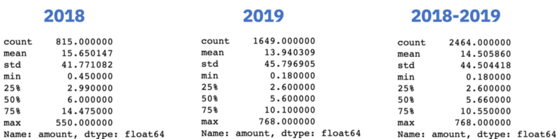
Considering the entire dataset (2018–2019), it appears my mean spend amount per transaction is £14.50, with a standard deviation of £44.50. This suggests a large degree of variability in my spending, which makes sense given I use Monzo for my day-to-day living e.g. travel and food, but also to pay for big ticket items such as bills, which are typically of much larger transaction amounts.
Interestingly, my median spend amount per transaction is £2.60, almost identical to the price of a cup of coffee (in London). I will later explore which are my most frequently visited shops to see if coffee really does influence the median transaction amount. But, for now, what’s clear is that I make many and small transactions using my Monzo account.
It’s also possible to visualise these statistics using the matplotlib library. EDA in visual format is often easier to understand than in numeric form. A histogram and box plot can be obtained from the trans_pos_amount dataframe using the .plot() method:
#plot a histogram and boxplot side by side
fig, (ax1, ax2) = plt.subplots(nrows=1, ncols=2, figsize=(10,5))
trans_pos_amount.plot(kind='hist', bins=600, grid=False, edgecolor = 'black', ax=ax1)
trans_pos_amount.plot(kind='box', ax=ax2)
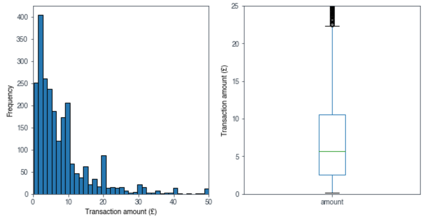
As the numeric data alluded to, we can see that most of my transactions are typically of small amounts, but a minority of large transactions skews the overall mean transaction amount higher.
Exploratory Data Analysis (EDA): spend categories & merchants
By knowing my spending habits, I know where I can make changes to my lifestyle, so that I can save more money in the long run. One way of doing that with the Monzo dataset is by filtering my transactions by category, e.g. bills, eating out, and transport. Whilst I may not be able to significantly alter the amount I spend on necessary outgoings such as bills and transport, I can make adjustments to discretionary outgoings such as eating out, shopping, and holidays.
The very handy .groupby() method in Pandas can be used to group transactions by category. It’s then straightforward to plot the grouped data by total amount spent in that category:
#plot the amount spent in each category over 2018 & 2019
trans_pos_amount.groupby('category').amount.sum().sort_values().plot(kind='barh')
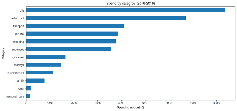
As I anticipated, I spent the most money on bills which includes things like rent, phone bill, council tax (you know, all the boring adult stuff). What I did find surprising, and embarrassing, is the fact that eating out is my second largest spend category, coming in at a whopping £6,700 over the two year period. Eating out is definitely one of those categories considered as discretionary, and as such, I could afford to cut back on meals out and drinks after work.
I can dig deeper into my spending habits by investigating which merchants I transact with the most. Where possible, Monzo provides us with detailed merchant information including name, location and social media details. I’m only interested in the merchant_name field, which can be accessed from within the dataframe. I create a new dataframe called merch_freq, and use the .value_counts() method to produce a list of merchants ordered by number of transactions (calling .head() returns the top 5 values in that last):
merch_freq = trans['merchant_name'].value_counts()
merch_freq .head()
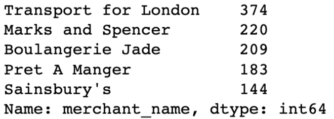
A visual of this information would be easier to interpret, but I only want to include my top 10 merchants, so I use the .nlargest() method on the dataframe, and then plot it with my top 10 merchants in order of frequency:
merch_freq.nlargest(10).sort_values().plot(kind='barh')
N.B. for confidentiality reasons, I have redacted one of the names of the merchants.
What is clear from this chart is that half of my top 10 merchants can be grouped into the ‘eating out’ category. It’s unsurprising that my most popular merchant is Transport for London, because I use my Monzo to tap in and out of the TfL network pretty much every day.
Earlier I questioned whether my median spend amount of £2.60 - the price of a coffee in London, could be explained by how many times I visited a coffee shop. Indeed, from the chart, there are two coffee shops (Boulangerie Jade & Pret A Manger) which clocked in a shocking 392 transactions. Approximately 16% of my transactions involved coffee! I think it’s fair to assume my coffee addiction does indeed influence my median spend per transaction.
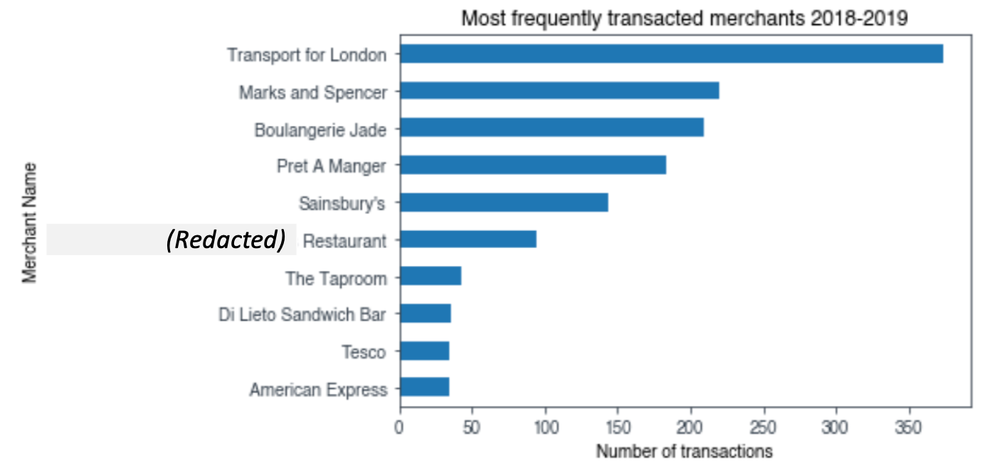
Whilst I have a top 10 most frequently transacted set of merchants, I wonder if the list changes much when I examine which merchants I spent the most money with? To investigate this, I create a new dataframe called merch_amount, and again use the .groupby() method, this time grouping by the merchant_name field. I sum the total amount spent at each merchant and then sort the dataframe by largest amounts first:
merch_amount = trans.groupby(trans['merchant_name'], sort=True).sum().sort_values('amount', ascending=False)
After that, it’s straightforward to create a plot:
merch_amount['amount'].nlargest(10).sort_values().plot(kind='barh')
Thankfully, I see far more merchants associated with bills and expenses within my top 10 by amount list. However, it’s disappointing that I am unable to reveal any more information about transactions made with my American Express using this dataset. I use my Monzo account to pay my American Express off, and therefore any information about those transactions essentially falls into a black hole (although I could utilise their API to get that data).
I’m not done exploring my coffee hypothesis. When I combine the total amount spent at Boulangerie Jade and Pret A Manger, I find over two years I wasted £1,037 on caffeine. Spread over a combined total of 392 transactions, that returns a mean value of £2.62, which is near identical to my median transaction amount over the entire dataset.
Comparing my 2018 to 2019
Finally, I want to examine how my usage of Monzo has changed between 2018 and 2019, and potentially see if there are any particularly expensive months I can anticipate in the future. My goal here is to create a bar chart which compares the total amount spent by month between 2018 and 2019.
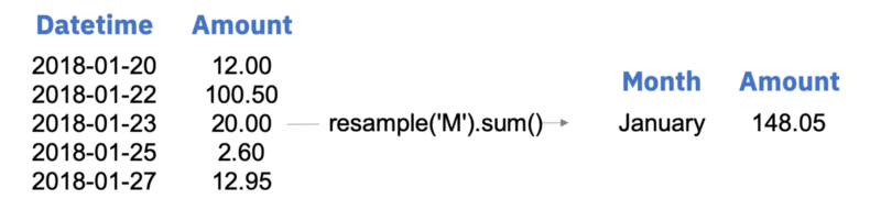
When cleaning the data at the start, I made sure to index each transaction with a datetime stamp. This step will now begin to pay dividends, because I can more easily filter on the data and use the .resample() method to group each transaction by month.
First, I filter the trans_pos_amountdataframe by year, and then use the .resample() and .sum() methods on the new df_2018dataframe:
df_2018 = trans_pos_amount.loc['2018']
df_2018_monthly_resample = df_2018.resample('M').sum()
Essentially, by resampling and then taking the sum, I am taking all the transactions within one month (specified when I parse ‘M’ into the method), and combining them into one numeric figure.
The df_2018_monthly_resample dataframe contains the total amount spent in each month of 2018. However, the index for this dataframe is not what I want. Instead of being indexed as an ordered list of months e.g. ‘Jan’, ‘Feb’, ‘Mar’, the dataframe is indexed as a datetime stamp e.g. ‘2018–01–31 00:00:00+00:00’. Not to worry though, I can set the index of my dataframe to whatever I desire, so long as the length of the new index matches the length of the dataframe. I simply create a list of months (labels_2018 and labels_2019) and then parse that list to the set.index() method:
df_2018_new_index = df_2018_monthly_resample.set_index([labels_2018])

df_2019_new_index = df_2019_monthly_resample.set_index([labels_2019])
I’m now able to combine the newly indexed 2018 and 2019 dataframes into one, by creating a new dataframe and using a key value pair to match the year against its respective dataframe:
df_2018_vs_2019 = pd.DataFrame({'2018':df_2018_new_index.amount, '2019':df_2019_new_index.amount}, index=labels_2018)
Now with one neat and tidy dataframe, I can plot the data to achieve my goal:
df_2018_vs_2019.plot(kind='bar')
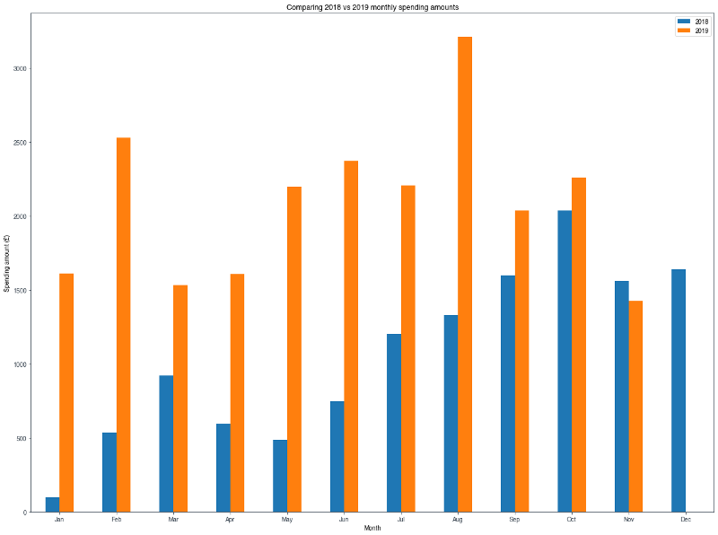
What’s clear from the chart is that my usage of Monzo in 2019 was far higher than in 2018. This is possibly explained by two things: 1. It took a bit of time to transition over to Monzo as my primary bank. 2. I earned more money in 2019, and that may be reflected in the amount I spent.
In terms of monthly trends, for 2019 there’s a definite increase as we approached the summer period (May to September), which seems to be declining as we now head into winter. This is logical given summer has longer days, and provides more opportunities to do what I do the most according to my data: eat and drink out!
Final Takeaways
At the start of this little project, I had a rough idea of how I was spending my money, but now I have some real insight. It’s clear I need to curtail my eating and drinking out habit, but I could also potentially look to explore more cost efficient ways to get around London. Transport for London is a huge outgoing for me, so it may yet be beneficial to use a City Mapper pass, or simply get a monthly season ticket.
Monzo provides a very clean and accessible dataset which can be used to do far more sophisticated things than simple EDA. In one such example, the merchant location information is used to create appealing maps of transactions. Whilst appealing, these maps can also be used to help users identify fraudulent activity, because a user is more likely to interact with their data in this novel format.
Indeed, the potential use cases for this dataset are limitless, and it’s one example of why the dawn of Open Banking is going to provide new and valuable ideas for startups and existing financial service providers.
Give it a go yourself
I highly recommend using data camp to up-skill yourself in data science and analytics. By following their videos, and then practising with their guided tutorials, I went from a beginner to analysing real world data in the space of a few weeks.
Reminder: link to the code required to run this analysis on your own data.